In this tutorial I’m going to show you how to create a basic block which mimics the functionality of an existing shortcode but providing a much better user experience.
We’ll demonstrate the case when there is already an existing plugin where we want to progressively migrate existing shortcodes into new blocks. Here you’ll find the GitHub repo with all the code.
Creating the Message Shortcode
We are going to start with a shortcode that displays a message with a couple of attributes: text and color :
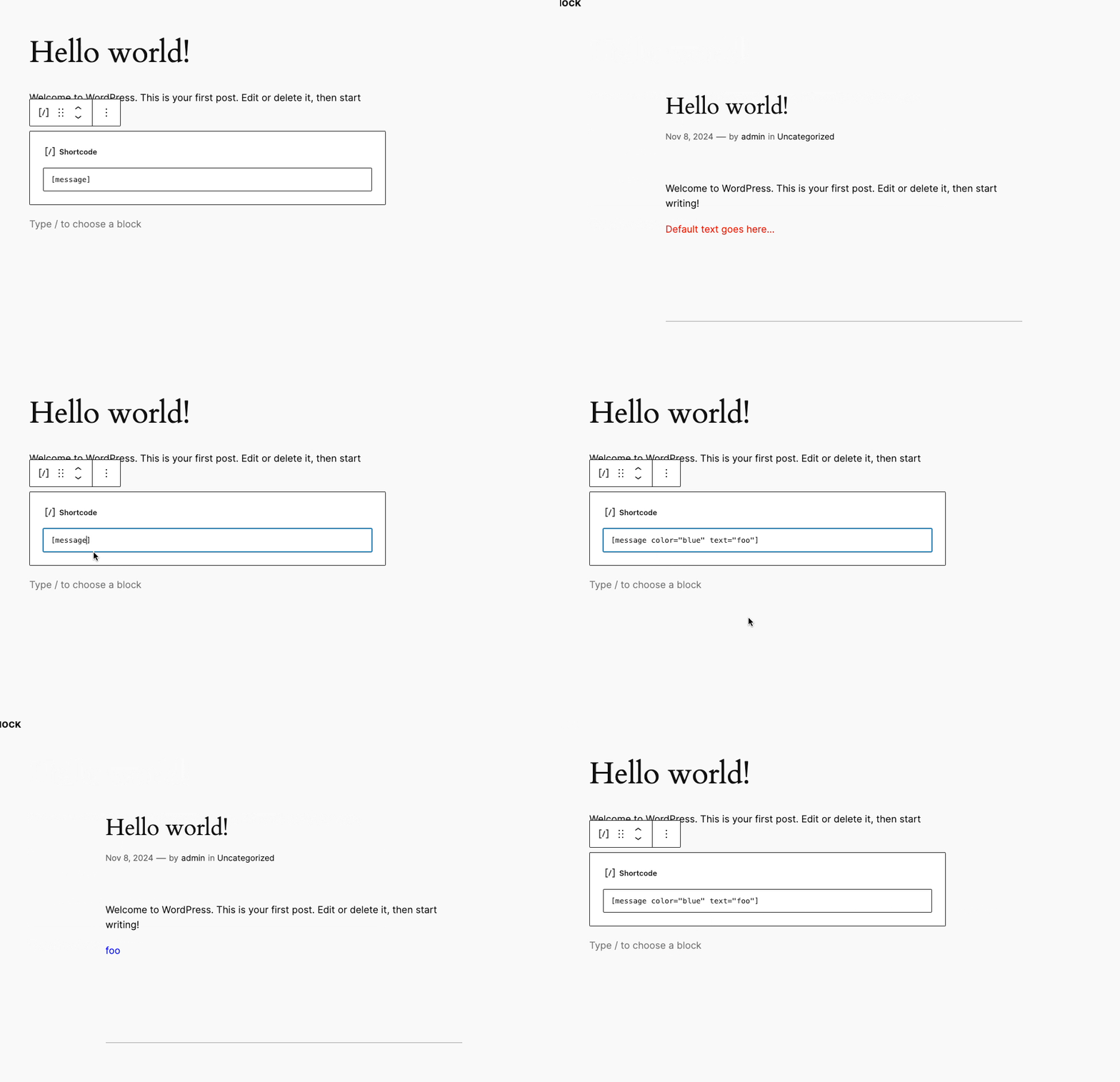
Here is the plugin file including the shortcode:
<?php
/**
 * Plugin Name: Shortcode to Block
 */

if (!defined('ABSPATH')) {
    exit;
}

add_shortcode('message', function ($attributes) {
    $atts = shortcode_atts(array(
        'color' => 'red',
        'text' => 'Default text goes here...',
    ), $attributes);

    return sprintf(
        '<p style="color:%s;">%s</p>',
        esc_attr($atts['color']),
        esc_attr($atts['text'])
    );
});
Creating the Message Block boilerplate
We are going to use @wordpress/create-block package to create the block boilerplate, in the root of your plugin run the following command:
npx @wordpress/create-block@latest message --no-plugin
Notice --no-plugin parameter at the end to not include the plugin file, omit this parameter if you want to create it from scratch.
If you are creating the plugin from scratch (using the above command without
--no-pluginparameter), feel free to skip the following section as @wordpress/scripts package is going to be installed and configured automatically for you.
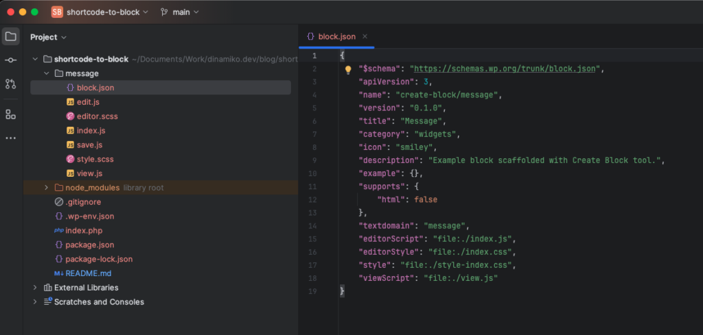
The above command creates a message directory with all the files needed for the block:
Next thing to do is install @wordpress/scripts package to build the assets, to do so run the following command:
npm install -D @wordpress/scripts
Once installed add the following scripts to your package.json:
  "scripts": {
    "build": "wp-scripts build --webpack-src-dir=message",
    "start": "wp-scripts start --webpack-src-dir=message"
  },
Notice how we are adding --webpack-src-dir parameter to indicate the source directory, in this case our message directory.
Now run the following command to build the assets:
npm run build
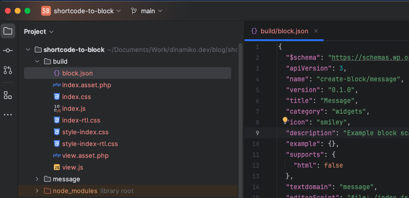
The above command compiles all the assets into a new build directory in the root of the plugin:
Finally we need to register the block, to do so add the following code to your plugin file:
add_action('init', function() {
    register_block_type( __DIR__ . '/build' );
});
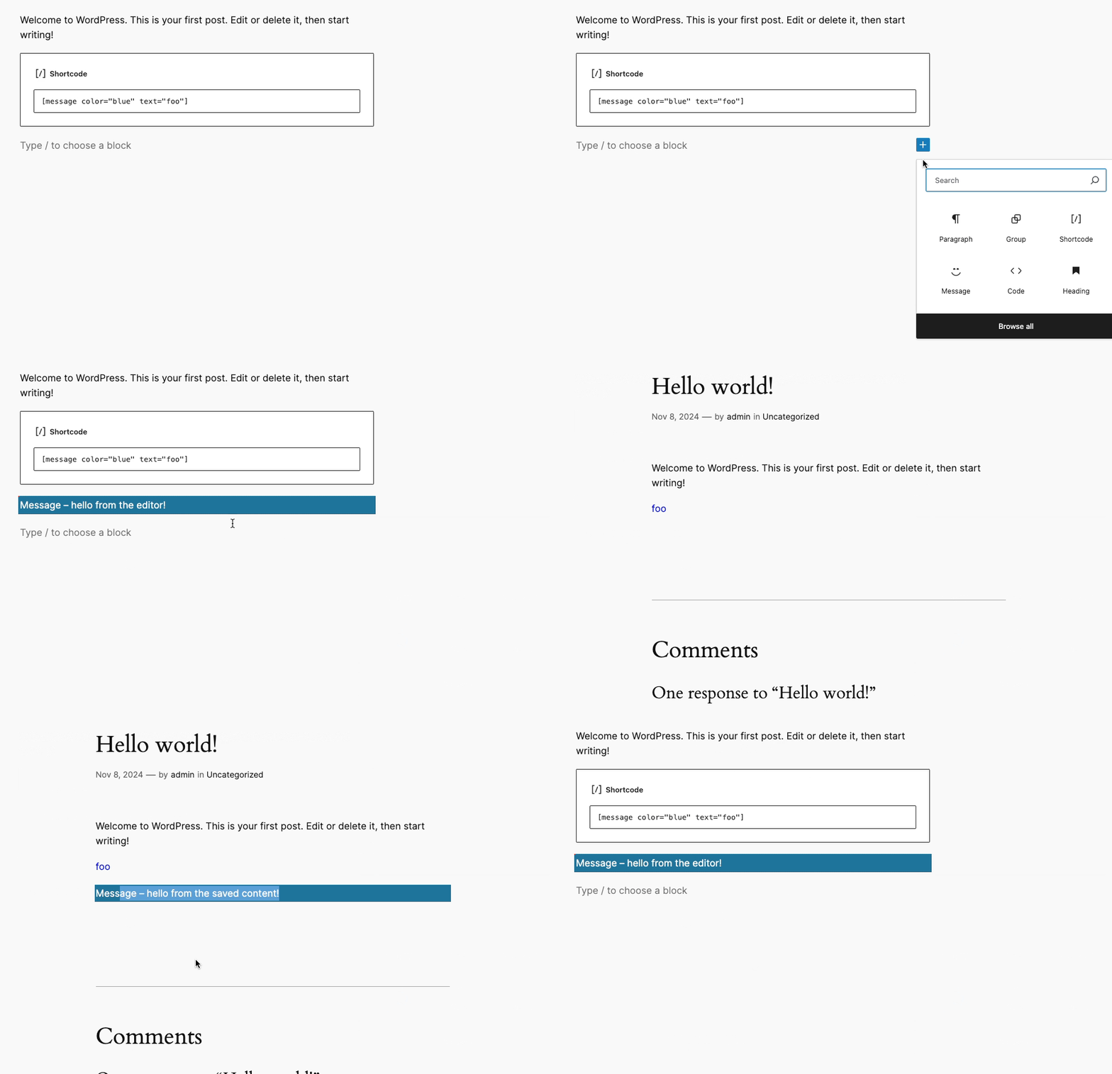
At this point we are ready to start working on the Message Block, let’s add it to our post:
Adding Block Attributes
The first thing to do is adding attributes to the Block, in our case only the text attribute as we are going to handle the color through the Block UI. Add the following to block.json:
  "attributes": {
    "text": {
      "type": "string",
      "default": "Default text goes here..."
    }
  },
In order to see the changes while developing please run the follow to command to watch and compile on each change:
npm run start
Then open edit.js and replace the Edit function with the following:
export default function Edit({attributes, setAttributes}) {
    const {text} = attributes;

    return (
        <TextControl
            {...useBlockProps()}
            label="Text"
            value={text}
            onChange={(value) => setAttributes({text: value})}
        />
    );
}
Here we are getting the text attribute from block attributes and adding its value to a TextControl component. We are also implementing the onChange by setting the value through setAttributes.
In order to see the text value reflected in the frontend we have to include it in save.js file like so:
export default function save({attributes}) {
	const { text } = attributes;

	return (
		<p { ...useBlockProps.save() }>
			{ text }
		</p>
	);
}
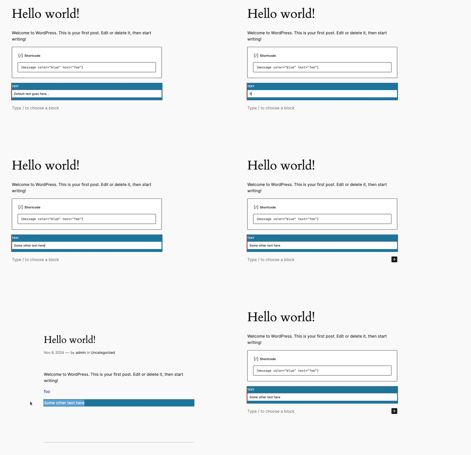
If we reload the editor page now we’ll see the default value we added into block.json also we can update and save the value that is going to be displayed in the frontend:
Using Supports for Block Styling
Here is where we are going to notice a user experience improvement compared to how we handled color attribute in the shortcode.
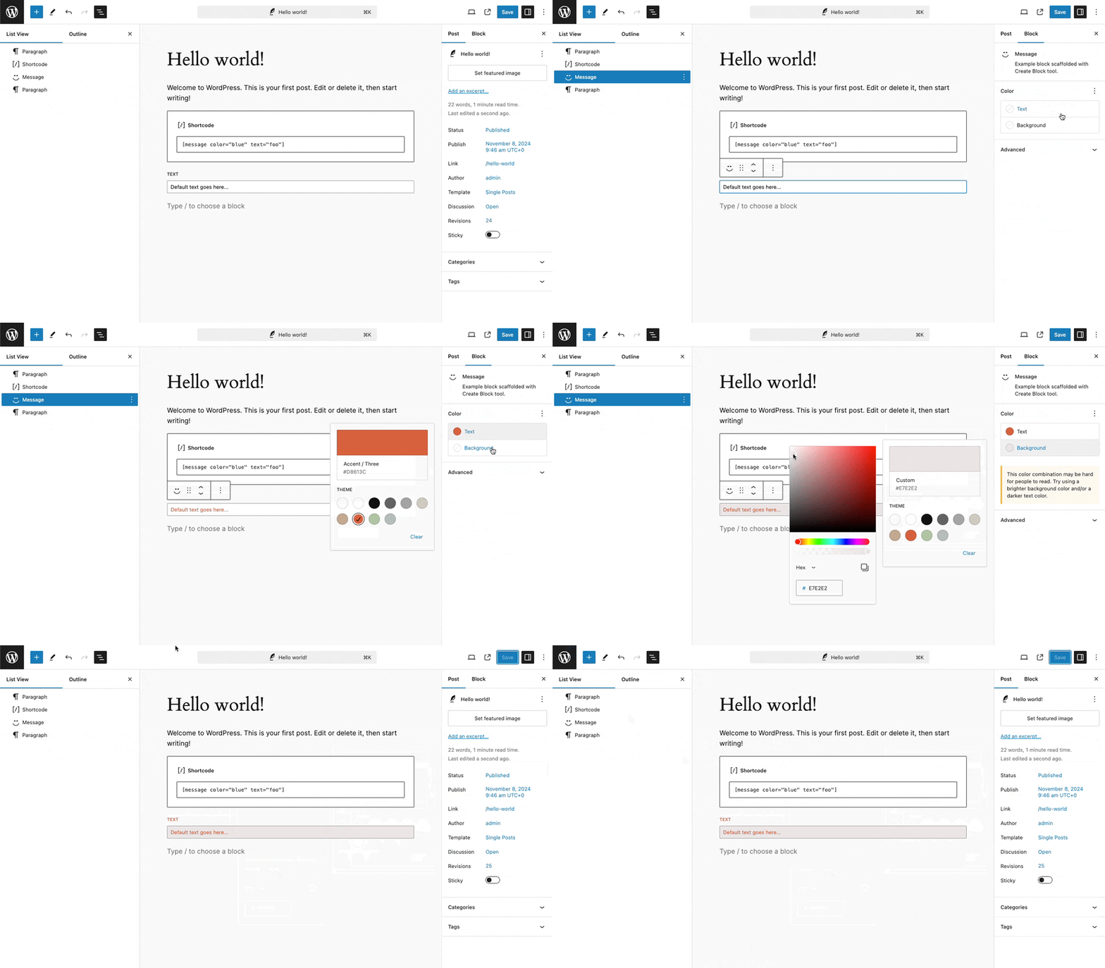
For basic block style we can include features into Supports, in our case we are going to include color like so in our block.json file:
  "supports": {
    "color": {}
  },
By adding the above we have now a complete UI for handling color in our block.
As we are going to get the styles from the block now please delete the contents of style.scss and editor.scss so we can clearly see how styles are applied.
That’s all, we have now created a block from an existing shortcode, while basic it demonstrates the steps to follow when we want to migrate existing shortcodes into new blocks.
